
What are the best colors for YouTube thumbnails? What 2 million videos show
Red, yellow, dark, bright, high contrast: across 2.08 million long-form videos, none of them moved the odds of a breakout by more than 2 points.

There is no best color for a YouTube thumbnail. I measured the main color, brightness and contrast of 2,075,071 long-form thumbnails from 35,526 creator channels, and every color family landed between 22.4% and 24.1% of videos reaching twice their channel's usual views. Yellow topped the list and purple sat at the bottom, but the whole spread is 1.7 points. Brightness and contrast are just as flat.
That does not mean thumbnails don't matter. It means the color itself is not what separates a breakout from an ordinary upload. Below is what I measured, where small differences do show up, and what to spend your thumbnail time on instead.
How I measured it
Every thumbnail in this study went through an automated image pass that records three things: the average brightness on a 0 (black) to 1 (white) scale, a contrast score on the same scale, and a palette of the most prominent colors. I took the strongest saturated color from that palette (the "vibrant" color) and sorted it into a hue family.
To judge performance I used each video's outlier score: its views divided by what that channel's videos usually get. A video at 2x did twice as well as its own channel's norm. Because the score is relative to the channel, a big channel's red thumbnails are not compared with a small channel's blue ones. Across the whole sample, 23.5% of videos reached 2x.
The sample is long-form videos (3 minutes or longer) published June 2025 to February 2026 by creator channels in the TubeAI database, with thumbnails analyzed between December 2025 and March 2026.
- 1.7 pointsGap between the best and worst color family24.1% yellow vs 22.4% purple
- 72.8%Thumbnails led by red, orange or yellow
- 0.5 pointsGap across five contrast levels
Which thumbnail color gets the most views?
None, in any way that matters. Yellow-led thumbnails reached 2x their channel's usual views 24.1% of the time, red 23.8%, green and cyan 23.6%. At the bottom, blue and orange were at 23.0% and purple at 22.4%. Gray thumbnails with no strong color sat at 23.0%, the same as blue.
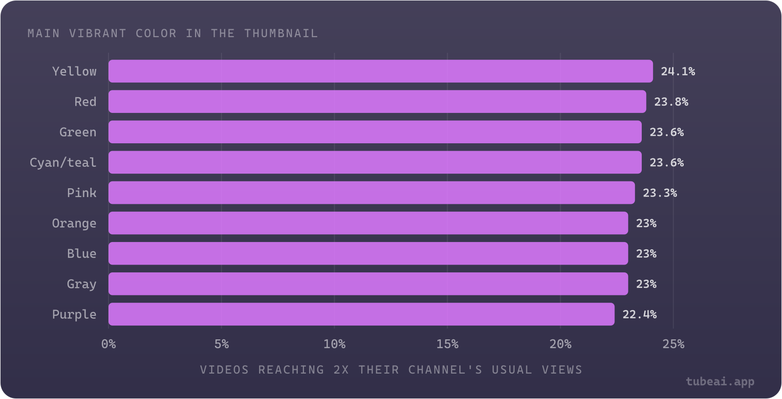
Chart data
| Main vibrant color in the thumbnail | Videos reaching 2x their channel's usual views (%) |
|---|---|
| Yellow | 24.1 |
| Red | 23.8 |
| Green | 23.6 |
| Cyan/teal | 23.6 |
| Pink | 23.3 |
| Orange | 23 |
| Blue | 23 |
| Gray | 23 |
| Purple | 22.4 |
What does stand out is how alike most thumbnails already look. Nearly three in four are led by a warm color. Blue is a distant fourth, and purple and gray together cover barely more than 1% of thumbnails.
| Main color | Videos | Share of thumbnails | Reached 2x |
|---|---|---|---|
| Red | 627,863 | 30.3% | 23.8% |
| Orange | 499,708 | 24.1% | 23.0% |
| Yellow | 383,865 | 18.5% | 24.1% |
| Blue | 233,297 | 11.2% | 23.0% |
| Cyan / teal | 140,432 | 6.8% | 23.6% |
| Green | 94,663 | 4.6% | 23.6% |
| Pink / magenta | 67,574 | 3.3% | 23.3% |
| Purple | 20,496 | 1.0% | 22.4% |
| Gray / no strong color | 7,172 | 0.3% | 23.0% |
Should a thumbnail be bright or dark?
It barely matters. The typical thumbnail sits at 0.42 brightness, and the bands from dark to very bright all land between 23.2% and 24.0%. The one band that trails is the very dark one: thumbnails under 0.20 brightness reached 2x 22.1% of the time, 1.4 points below the average. That is the only brightness signal in the data, and it is small.
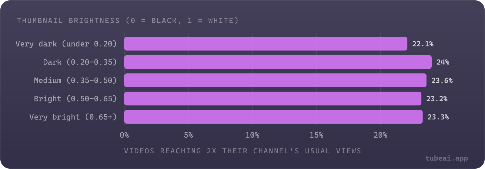
Chart data
| Thumbnail brightness (0 = black, 1 = white) | Videos reaching 2x their channel's usual views (%) |
|---|---|
| Very dark (under 0.20) | 22.1 |
| Dark (0.20-0.35) | 24 |
| Medium (0.35-0.50) | 23.6 |
| Bright (0.50-0.65) | 23.2 |
| Very bright (0.65+) | 23.3 |
Only 57,355 videos (2.8%) used a very dark thumbnail. If yours is one of them, the honest read is "slightly behind", not "broken".
Does high contrast help a thumbnail?
Contrast is the flattest measure of the three. Across five contrast bands, the share of videos reaching 2x ran from 23.2% to 23.7%, a gap of half a point.
| Contrast score | Videos | Channels | Reached 2x |
|---|---|---|---|
| Low (under 0.35) | 117,313 | 19,435 | 23.2% |
| Below average (0.35-0.45) | 469,739 | 30,858 | 23.3% |
| Average (0.45-0.55) | 838,063 | 33,164 | 23.6% |
| High (0.55-0.65) | 513,874 | 30,574 | 23.7% |
| Very high (0.65+) | 136,082 | 20,211 | 23.4% |
What if you change your usual style?
A common piece of advice is to break your own pattern: if every thumbnail on your channel is dark, try a bright one. I tested that by comparing each thumbnail with the median of its own channel's thumbnails, for channels with at least 10 analyzed videos. Going much brighter or much darker than usual did not change the odds in any useful way.
| Brightness vs the channel's median | Videos | Channels | Reached 2x |
|---|---|---|---|
| Much darker (0.15+ below) | 116,410 | 21,930 | 22.8% |
| Darker (0.05-0.15 below) | 435,746 | 27,943 | 23.6% |
| About the same | 946,263 | 28,225 | 23.4% |
| Brighter (0.05-0.15 above) | 417,301 | 27,929 | 23.7% |
| Much brighter (0.15+ above) | 131,178 | 22,492 | 23.7% |
Contrast told the same story: from much lower to much higher than the channel's norm, the share reaching 2x stayed between 23.2% and 23.8%.
Does it depend on the niche?
Slightly. Niches do set different defaults: Crypto (median brightness 0.36) and Movie & TV Reviews (0.37) run the darkest, Home & DIY (0.49) and Lifestyle & Personal (0.48) the brightest. In most niches dark and bright thumbnails perform within 2 points of each other. A few lean one way:
| Niche | Channels | Dark | Bright | Difference |
|---|---|---|---|---|
| Politics & Government | 299 | 27.6% | 22.9% | -4.7 pts |
| Comedy & Satire | 663 | 25.1% | 20.6% | -4.5 pts |
| Relationships & Family | 459 | 24.4% | 21.0% | -3.4 pts |
| Reaction Videos | 692 | 28.0% | 26.1% | -1.9 pts |
| Gaming | 5,694 | 23.9% | 24.6% | +0.7 pts |
| Crypto | 277 | 17.4% | 18.7% | +1.3 pts |
| Health & Fitness | 1,330 | 24.3% | 26.0% | +1.7 pts |
| Product Reviews & Demos | 401 | 24.9% | 27.0% | +2.1 pts |
Read these with care. A niche-level gap can come from which channels use which style (a few dark-thumbnail political channels that do well, for example) rather than from the brightness itself, and the within-channel test above found no general effect. The fair conclusion: in commentary-style niches, a dark, moody thumbnail is not a handicap, and in product and fitness niches a bright one is not either.
What to work on instead
If color, brightness and contrast explain almost nothing, the variation sits in what an image-wide measurement cannot see: the subject, the face and its expression, the text, and how well the thumbnail and title together promise something worth clicking. That is consistent with what creators find when they test whole thumbnails against each other.
A practical order of priorities for a thumbnail
Decide the one idea the thumbnail shows
One subject, one promise. Pick the concept before you open a design tool.
Make it readable small
Thumbnails are mostly seen at small sizes. Check that the subject and any text still read at a glance.
Match the title, don't repeat it
The thumbnail and title should add up to one clear reason to click, not say the same thing twice.
Avoid very dark images
The only color-related signal in the data: thumbnails under 0.20 brightness trail slightly.
Test whole thumbnails, not swatches
Compare two different concepts with YouTube's Test & Compare instead of two shades of the same one.
For more on what actually moves thumbnail results, see what 460 real thumbnail A/B tests show, whether changing a thumbnail after upload increases views, how YouTube's bigger thumbnails changed the feed, and whether clickbait packaging works.
Questions about thumbnail colors
What is the best color for a YouTube thumbnail?
There isn't one. Across 2,075,070 long-form videos, every color family reached 2x its channel's usual views between 22.4% (purple) and 24.1% (yellow) of the time. Pick colors that make your subject and text easy to read, not a color you expect the algorithm to favor.
Do red and yellow thumbnails get more views?
Yellow (24.1%) and red (23.8%) are at the top, but only 0.3 to 0.6 points above the 23.5% average. They are also by far the most common: red, orange and yellow lead 72.8% of thumbnails.
Are dark thumbnails bad?
Only very dark ones trail, and only slightly: thumbnails under 0.20 brightness reached 2x 22.1% of the time, against 24.0% for dark thumbnails between 0.20 and 0.35.
Should I use high contrast in my thumbnails?
Contrast made almost no difference: from low to very high contrast, the share of videos reaching 2x stayed between 23.2% and 23.7%.
Should I change my thumbnail colors to stand out from my usual style?
Changing brightness or contrast compared with your own channel's usual thumbnails did not help in our data: the share reaching 2x stayed between 22.8% and 23.8%. A different idea in the thumbnail is a better bet than a different palette.